
This article was co-authored by Jisoo Lee.
The world is producing information at an exponential rate, but that may come at the cost of more noise or become too costly. With all this data, it can be increasingly challenging for models to be useful, even as effective analytics becomes the core of every business model. A good choice of model performance metrics may provide the modeler a realistic view of their ability to predict outcomes on a static dataset, but the world around us changes faster than ever. Acceptable performance now can quickly degrade in unexpected ways and Influence Sensitivity Plots are a helpful tool to understand and identify areas where we can improve the accuracy of our models, not only today but into the future.
Quantitative Input Influence Drives Explainability for ISPs
Explainability (sometimes referred to as interpretability) is a fundamental pillar of model quality. Explainability methods typically either explain general trends in a model (global explanations) or behavior on individual predictions (local explanations). Shapley values are a general tool that helps attribute the output of a function to its inputs, and are used extensively to explain why a ML model made a certain prediction. Datta et al. laid out a general framework for doing this called Quantitative Input Influence (QII).
As a refresher, this blog on Shapley value-based feature influences explains how Shapley values take a game theoretic approach to capture the marginal contributions of each feature to the model score. However, due to special properties that Shapley values enjoy, the Shapley values of a feature for one prediction is on the same scale and directly comparable to a different prediction. This property makes it very powerful in terms of aggregating the influences of individual predictions to create a global view of how the model is behaving.
One way of doing that is an Influence Sensitivity Plot (ISP), which maps feature values to feature influences for each feature. This view provides an insight into how an AI model is internally responding to a feature to make predictions (the SHAP open source implementation of Shapley values also provides a version of this visualization called a dependence plot). In this article we’ll dive deep into what an Influence Sensitivity Plot is and the range of insights you can glean about your model from this important AI explainability tool.
Similar Visualization Methods for Explainability
At a high level, we are looking to isolate the effect of a single feature and its role in the model’s decision making. To visually understand this effect, we can consider a wide variety of tools including partial dependence plots (PDPs), accumulated local effects (ALE) plots, and influence sensitivity plots (ISPs). This post will touch on how ISPs overcome some of the challenges faced by PDPs and ALEs, and expand on the value that ISPs can bring to your model improvement workflow.
By construction, PDPs vary one feature while independently randomizing the rest in order to compute the marginal effect of a given feature. For a simple example where this may skew the model interpretation, consider an auto-insurance loss prediction model with just three features: age, miles driven per month, and number of past accidents. To build a partial dependence plot for the number of past accidents, we would adjust its value to all possible values of past accidents while randomizing the other features (in this case, age and miles driven per month). After repeating this process for every observation in the data, the next step is to average the observations for each value of past accidents and plot. Unfortunately, the feature estimations we just computed include pairings that are unlikely in reality (16-year-old new drivers with past accidents), and are therefore biased in this way.
QII values also break correlations to understand the marginal impact of a feature. However instead of doing it one feature at a time, they account for feature interactions by averaging the feature’s marginal influence over every other set of feature combinations.
While ALE plots solve this issue of feature independence, they run into a different snag. ALEs by definition compute the effects of feature perturbation locally, and therefore cannot be reliably interpreted across multiple intervals. There is also no accepted best practice for selecting local interval size. ALEs can be shaky (varying widely) when too many intervals are chosen, but can quickly lose accuracy if we select too few. Finding the goldilocks zone for ALEs can be time consuming and error prone. Because ISPs essentially show the influence of every single point in the dataset, there is no concept of a neighborhood that is required to interpret the visualization.
ISPs solve a number of issues with alternative methods such as PDPs and ALE plots. The QII values behind the curtain of ISPs attribute how much of the difference between the output for a given point and the comparison group are accounted for by that feature. This method is key for overcoming the hurdles above – we can use ISPs to understand feature influence in an unbiased way, even for interacting features and we can even interpret these influences globally.
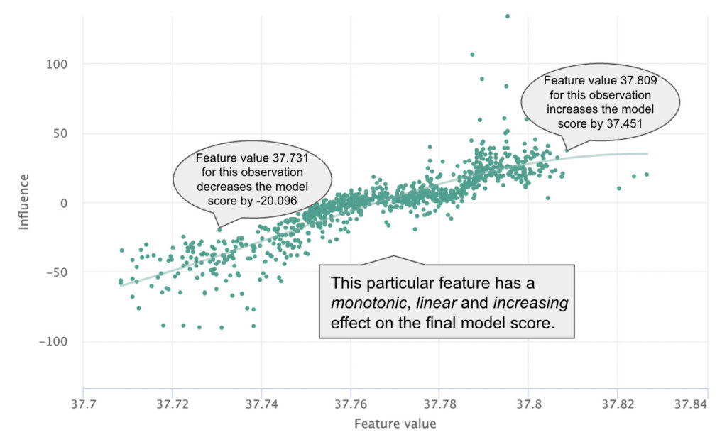
Similar to SHAP’s Dependence Plot, an Influence Sensitivity Plot (ISP) plots the feature values of real observations in the data against their QII values to understand the effect of a particular feature on the final model score. Plotted in this way, we can quickly gain a sense of the global trend of feature influence. Is it positive or negative? Is it monotonic? Is it linear?
Within a given slice of the feature value, we can also get a sense of the range of influences for that slice. If the range is narrow, we can say that the feature value has stronger influence in isolation, whereas a dispersion along the Y-axis is a good indicator of feature interaction. Last, we can examine observations individually to understand local influences that would be hidden by PDPs and gain insight into the heterogeneity of feature influence across the whole dataset.
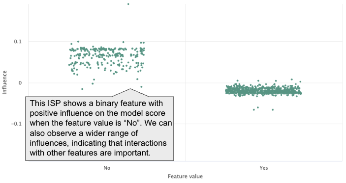
ISPs can be used for categorical features as well. Above is a simple example showing the feature influence of a binary variable. We can observe not only the difference in influence but also the difference in range between the two values, providing the same insight we were able to glean for continuous features.
Grouped ISPs for Segment Analysis and Model Comparison
Like many common visualization techniques, we can differentiate subsets of points displayed to convey additional information using a technique called grouped ISPs. This often uncovers diverging patterns of influence – two common ways to group ISPs are by slicing (segmenting) the data, or to layer in a second model.
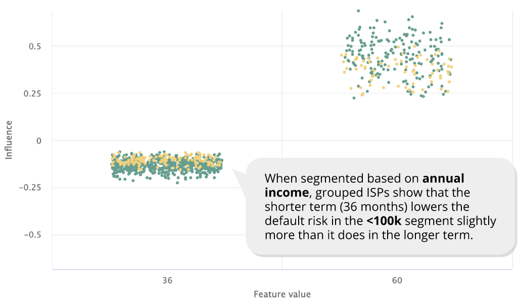
Understanding the feature behavior in a meaningful subset of a dataset can be as important as understanding it in the whole dataset. There are different ways to identify such meaningful subsets, and subject matter experts often have subsets (or “segments”) in mind that they want to pay attention to. As performance often diverges across different segments, understanding how the model treats different segments can be critical, and grouped ISPs are especially powerful for comparing the feature influence across these segments.
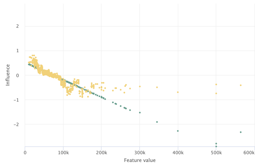
Grouped ISPs are also powerful for comparing the feature influence across different models. Because we can observe the influence of individual observations, we can draw comparisons of how different models diverge in their treatment of a particular observation in addition to changes in how the model score is influenced by the feature overall.
Enabling the ISP with Accompanying Charts
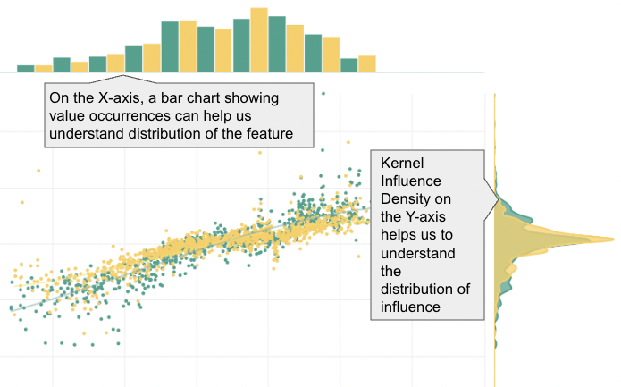
Charts for influence density and data value occurrences can also accompany the ISP to enrich our understanding of a given feature. This combination brings us a dynamic trio to leverage for understanding our model, ensuring conceptual soundness and making quality improvements!
This blog has been republished by AIIA. To view the original article, please click here: https://truera.com/influence-sensitivity-plots-explained/
Recent Comments