AI INFRASTRUCTURE ALLIANCE
Building the Canonical Stack for Machine Learning


Our Work
At the AI Infrastructure Alliance, we’re dedicated to bringing together the essential building blocks for the Artificial Intelligence applications of today and tomorrow.
Right now, we’re seeing the evolution of a Canonical Stack (CS) for machine learning. It’s coming together through the efforts of many different people, projects and organizations. No one group can do it alone. That’s why we’ve created the Alliance to act as a focal point that brings together many different groups in one place.
The Alliance and its members bring striking clarity to this quickly developing field by highlighting the strongest platforms and showing how different components of a complete enterprise machine learning stack can and should interoperate. We deliver essential reports and research, virtual events packed with fantastic speakers and visual graphics that make sense of an ever-changing landscape.
Download the Enterprise Generative AI Adoption Report
Oct 2023
Our biggest report of the year covers the wide world of agents, large language models and smart apps. This massive guide dives deep into the next-gen emerging stack of AI, prompt engineering, open source and closed source generative models, common app design patterns, legal challenges, LLM logic and reasoning and more.
Get it now. FREE.

AI Landscape

Check out our constantly updated AI Landscape Graphic that shows the full range of capabilities for major MLOps tools instead of just pigeonholing them into a single box that highlights only one aspect of their primary characteristics.
Today’s MLOps tooling offers a broad sweep of possibilities for data engineering and data science teams. You can’t easily see those capabilities in typical graphics that show a bunch of logos so we’ve engineered a better info-graphic to let you quickly figure out if a tool does what you need now.
Events – Past and Future
Check here for our upcoming events and to watch videos from past events. We put on 3 to 4 major events every year and they’re packed with fantastic speakers from across the AI/ML ecosystem.

MEMBERS
ARTICLES

Enabling AI Regulation Compliance for Enterprises
Learn about new government regulations for safer, more trustworthy AI products – and how we're addressing them As generative AI continues to make headlines, international efforts are underway to both harness the promise and address the risks of artificial...

Saving and Restoring Machine Learning Models with W&B
Introduction In this notebook, we'll look at how to save and restore your machine learning models with Weights & Biases. W&B lets you save everything you need to reproduce your models - weights, architecture, predictions, and code to a safe place. This is...

Olivio Sarikas – How AI Will Redefine Culture and Entertainment
Podcaster and Vlogger Olivio Sarakis delivers a terrific talk on how AI will transform culture and entertainment. A dash of art history, a touch of diffusion models and a bit of philsophy make for one of the more unique and intriguing talk at our LLMs and the...
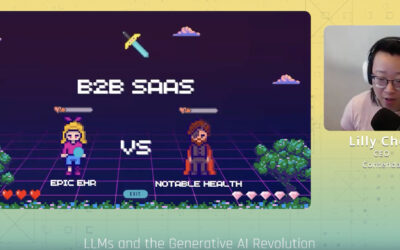
Lilly Chen – Contenda – LLM Valley: A Video Game-Themed Talk Through AI Product Markets and Venture Capital
Lilly Chen of Contenda delivers and fun and funny talk on AI product market fit and venture capital through the lens of an old-school video adventure game.
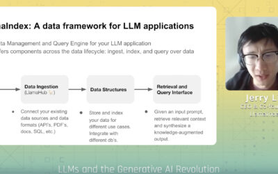
LlamaIndex – Practical Data Considerations for Building Production Ready LLM Apps
LlamaIndex CEO Jerry Liu walks us through the various ways to build production ready LLMs. He walks us through Retrieval Augmented Generation and many of the challenges with getting it right in the real world.

AI Quality Management: Key Processes and Tools, Part 2
Achieving high AI Quality requires the right combination of people, processes, and tools. In the last blog post, we introduced the processes and tools for driving AI Quality in the early stages of model development – data quality assessment, feature development, and...
Connect with Us
Follow US